
The Curated Entryway: 2026 Front Door Trend Report - Austin Metro
In Austin, the front door has evolved into the "curb appeal anchor." We are seeing a decisive move away from sterile, builder-grade neutrals toward "Quiet Luxury" and "Nature-Focused Grounding." Below is your updated trend report, featuring the definitive 10-color palette for 2026 using only Sherwin-Williams and Benjamin Moore selections.
Below is the 2026 Front Door Painting Trend Report, compiled from the latest industry releases and designer forecasts.
The 2026 Color Palette: "Organic Sophistication"
This year’s colors are divided into three distinct "moods" that homeowners are using to personalize their exteriors.
The "New Earth" Greens
Green is officially the new neutral for 2026. These shades are designed to blend the home with its landscaping.
Warm Eucalyptus & Smoky Jade: Restorative, soft greens that feel more sophisticated than traditional sage.
Top Pick: Sherwin-Williams: SW 6215 Rocky River — A deep, sophisticated green-blue with moody undertones.
Moody Olive & Forest: Deep, desaturated greens that read almost like a shadow.
Top Pick: Benjamin Moore: Narragansett Green.
Heritage Reds & Purples
Homeowners are leaning into "Nostalgic Luxury" with deep, wine-inspired tones that pair beautifully with stone and brick.
Aubergine & Plum: Dark purples with brown undertones. They feel more "historic" and less "trendy."
Top Pick: Benjamin Moore: Silhouette (2026 Color of the Year) — A luxurious charcoal-plum-brown.
Oxblood & Terracotta: Earthy, sun-baked reds that add warmth without the brightness of a fire-engine red.
The "Moody Teal" Explosion
Teal has emerged as the "wild card" of 2026. It sits between blue and green, offering a "confident but calm" entrance.
Top Pick: Farrow & Ball: Oval Room Blue.
The definitive 10-colors for 2026
Silhouette (AF-655) | Benjamin Moore
Mood: It is an incredible example of "Quiet Luxury." Neither strictly brown nor strictly gray, it feels like an expensive, custom-tailored wool suit.
Style: Best for modern-traditional homes. It provides a dramatic, "cocooning" feel that signals a home filled with art and curated textures.
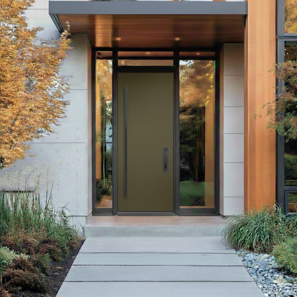
Dark Olive (2140-30) | Benjamin Moore
Mood: This color evokes the feeling of an old English estate. It is earthy and "slow-living" in its appeal—calm, studious, and deeply connected to nature.
Style: Perfect for homes with heavy landscaping, stone accents, or historic architecture. It bridges the gap between "forest" and "fashion."

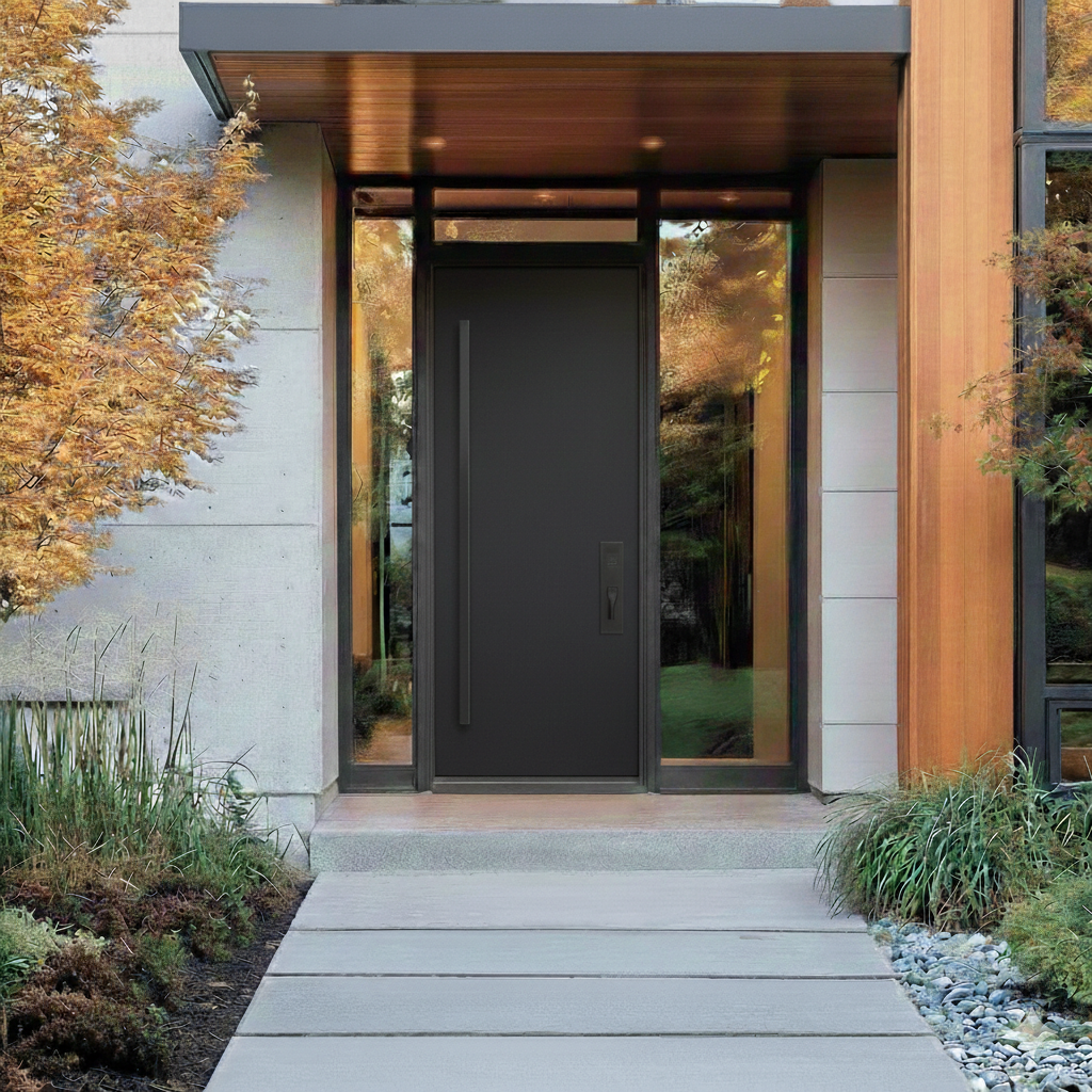
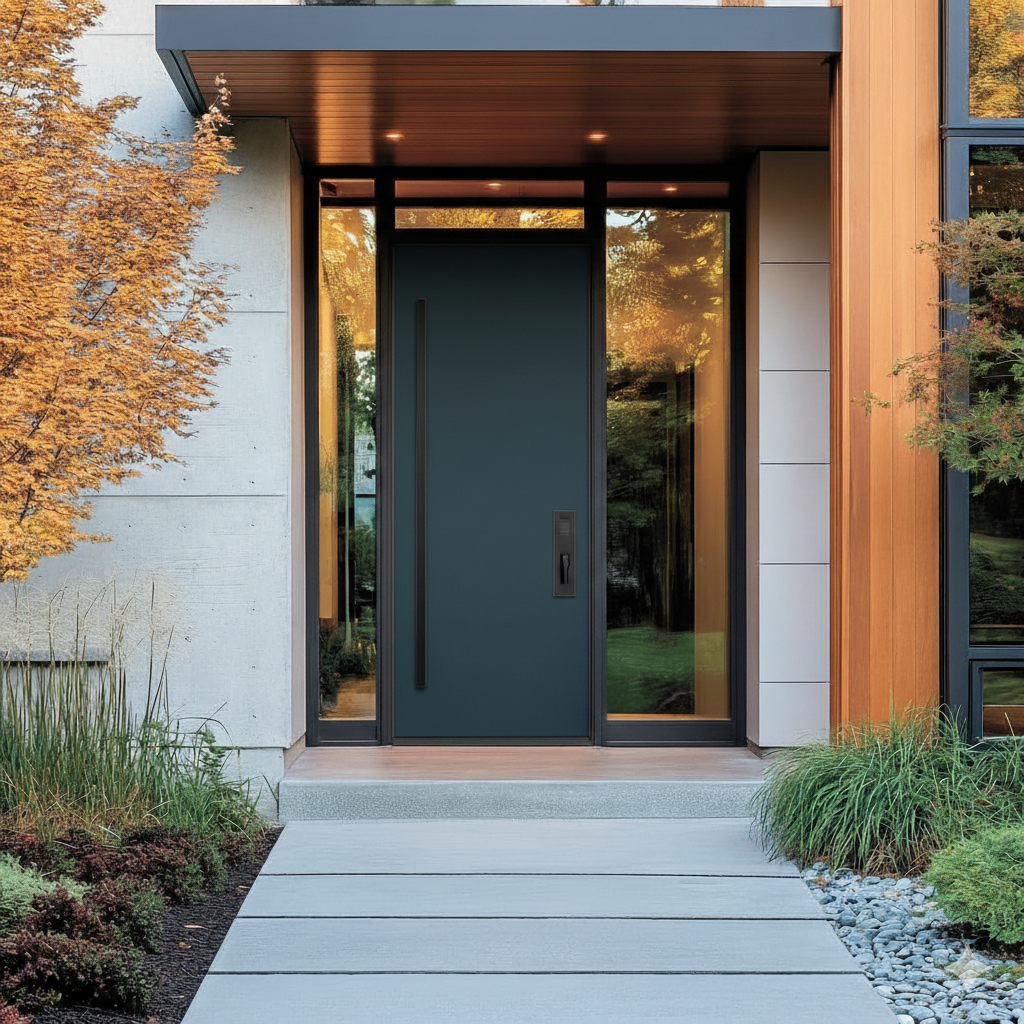
Iron Ore (SW 7069) | Sherwin-Williams
Mood: Unlike a harsh "Tuxedo Black," Iron Ore is a soft charcoal. It feels "velvety" and mysterious, providing depth without the starkness of a true black.
Style: The ultimate choice for "Modern Farmhouse" or "Industrial Chic." It looks incredibly expensive in a Satin finish.
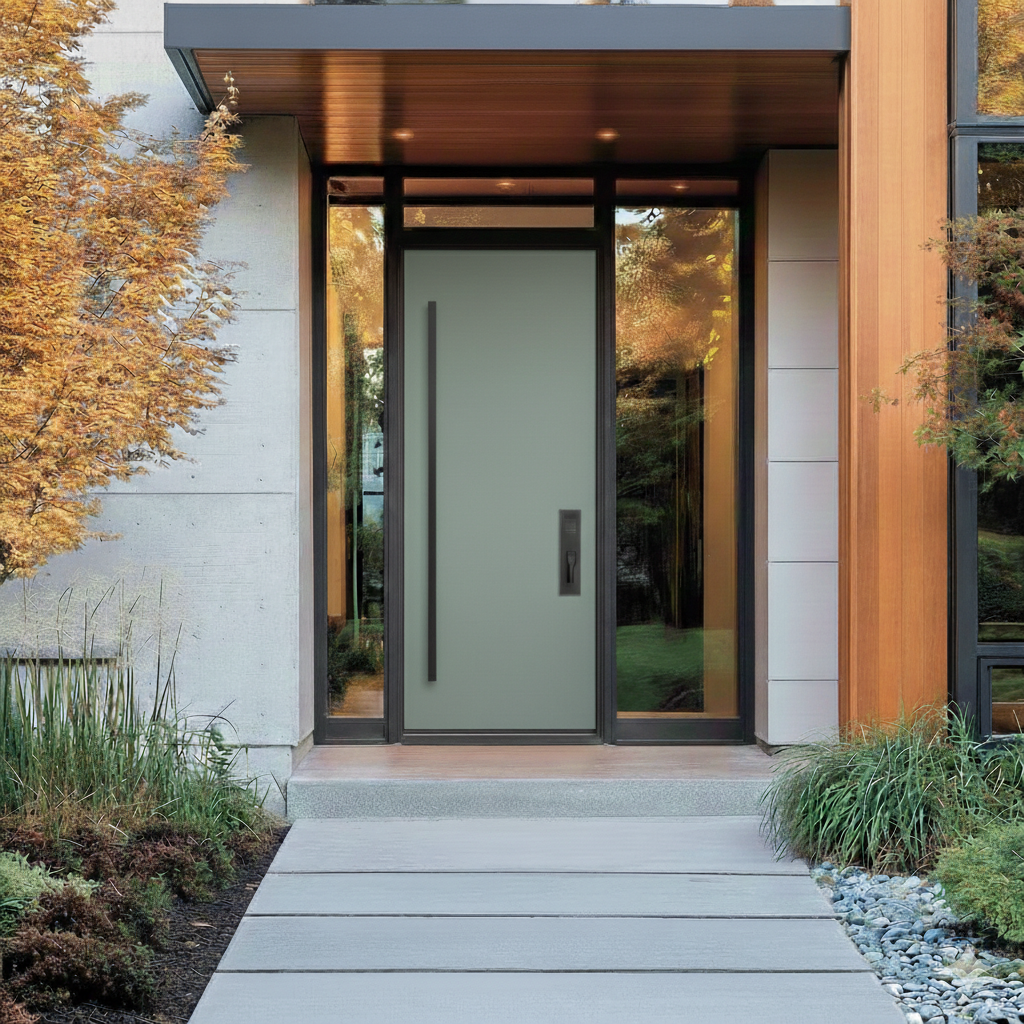
Evergreen Fog (SW 9130) | Sherwin-Williams
Mood: A "chameleon" color that shifts between green, gray, and blue depending on the sky. It feels like a foggy morning in a forest—hushed and peaceful.
Style: Best for cottage-style homes or any entryway where you want to lower the "visual volume." It pairs beautifully with natural wood porch ceilings.
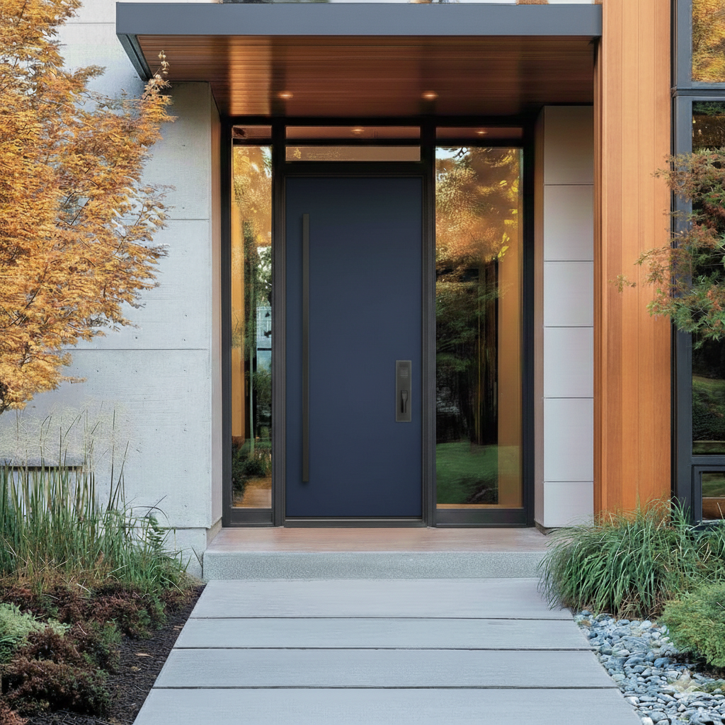
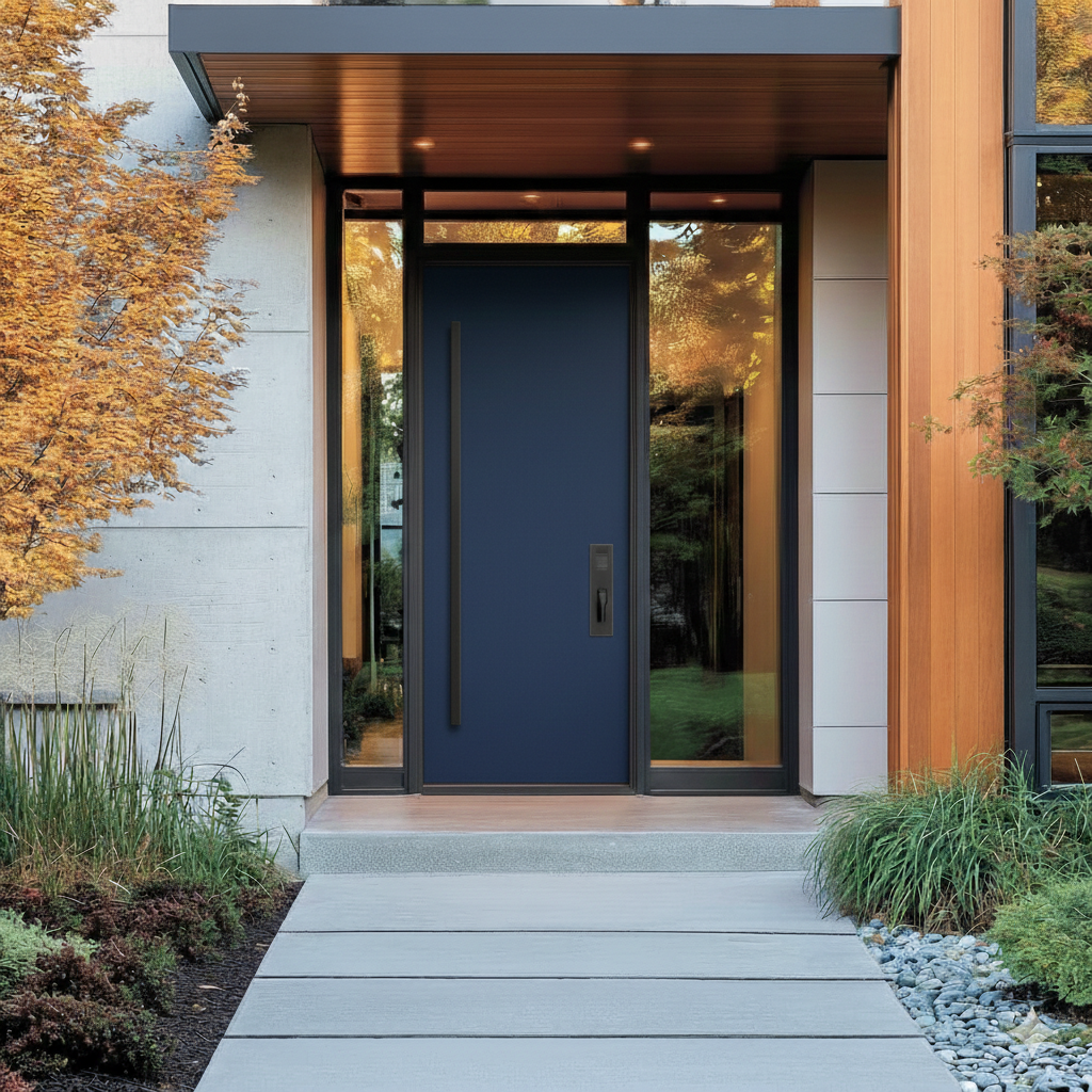
Hale Navy (HC-154) | Benjamin Moore
Mood: This is the "Goldilocks" of blues—not too bright, not too black. It feels dependable, classic, and high-functioning.
Style: Ideal for coastal or colonial homes. It looks particularly striking when paired with crisp white trim and polished nickel hardware.
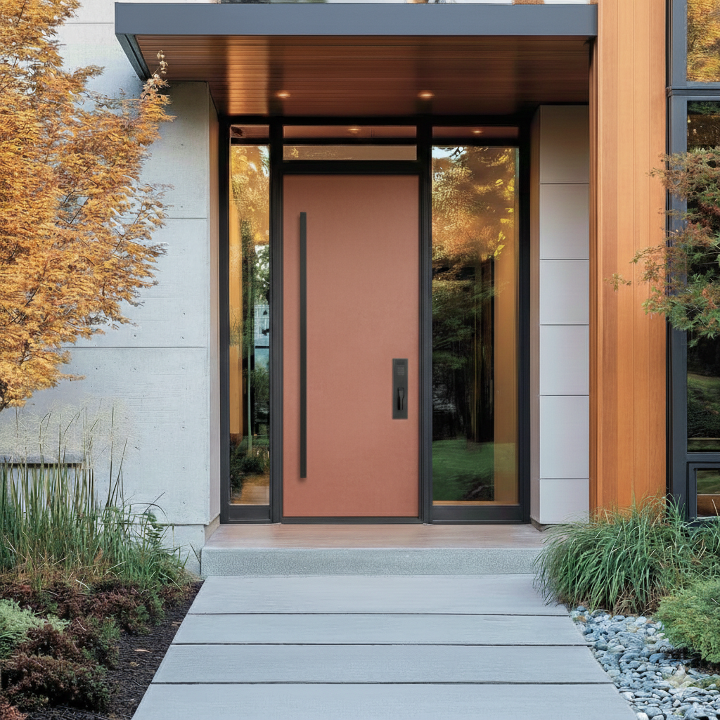
Redend Point (SW 9081) | Sherwin-Williams
Mood: A soulful mix of blush and beige. It’s a "hug" in paint form—inviting, soft, and unpretentious.
Style: Perfect for desert-modern or minimalist homes. It’s the "new neutral" for someone who finds white too cold but wants to avoid dark colors.
Newburyport Blue (HC-155) | Benjamin Moore
Mood: Brighter and more "vocal" than Hale Navy. It carries an understated "Old Money" quality—classic but with enough pigment to be noticed from the street.
Style: Exceptional on homes with red brick. The blue-orange contrast makes the door the immediate focal point of the property.

Urbane Bronze (SW 7048) | Sherwin-Williams
Mood: It feels like a mix of warm stone and dark wood. It’s a "grounding" color that suggests stability and organic roots.
Style: The best choice for homes with mixed materials (wood, metal, stone). It makes the front door look heavy and secure.
Salamander (2123-10) | Benjamin Moore
Mood: A teal-green so dark it borders on black. It feels lush, like a deep lagoon. It’s a "connoisseur’s choice"—subtle until the sun hits it.
Style: High-fashion and edgy. This is the color to choose if you want the "all-black" look but with a hidden layer of forest-green complexity.
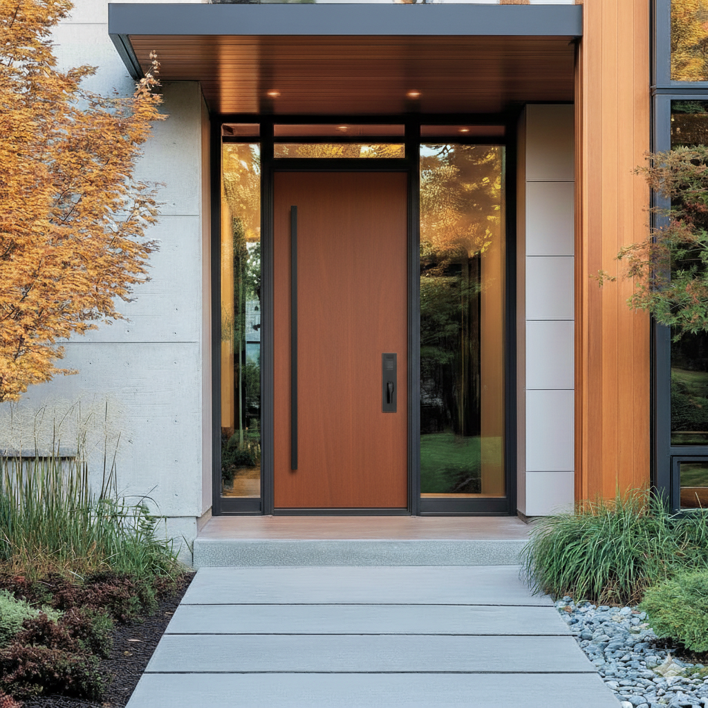
Spiced Cider (SW 7702) | Sherwin-Williams
Mood: A sun-baked terracotta that feels like an autumn afternoon. It is energetic, welcoming, and suggests a home that is full of life and warmth.
Style: Best for Southwestern, Mediterranean, or mid-century modern homes. It stands out beautifully against white or cream stucco.
Hardware Pairings
To pull off the 2026 "Curated Entryway" look, the hardware shouldn't just be functional—it should act like jewelry for your door. Here are the recommended hardware pairings for the 10 colors we discussed, categorized by the "vibe" they create.
1. The "Old World" Pairing: Unlacquered Brass or Antique Gold
Best for: Dark Olive (BM), Silhouette (BM), Salamander (BM)
Why it works: These deep, organic tones need the warmth of gold to keep them from looking "muddy." Unlacquered brass is particularly trendy in 2026 because it develops a natural patina over time, echoing the "nature-focused grounding" trend.
Thought starter: Use a long-plate handle set (rather than just a round knob) to emphasize the historic, luxury feel.
2. The "High-Contrast" Pairing: Matte Black
Best for: Evergreen Fog (SW), Redend Point (SW), Spiced Cider (SW)
Why it works: These are lighter or more "muted" colors. Matte black hardware provides a sharp, modern anchor that prevents these softer colors from looking "washed out" in bright sunlight.
Thought starter: Choose square-profile hardware for a modern-minimalist look, or arch-profile for a softer, transitional feel.
3. The "Timeless Executive" Pairing: Polished Nickel or Chrome
Best for: Hale Navy (BM), Newburyport Blue (BM), Iron Ore (SW)
Why it works: Cool-toned blues and charcoals look incredibly crisp against silver finishes. While Chrome is very bright, Polished Nickel has a slight warmth to it that feels more premium and less "industrial."
Thought starter: This is the best pairing for a High-Gloss finish. The reflection of the paint combined with the shine of the nickel creates a "jewel box" effect.
4. The "Organic Modern" Pairing: Oil-Rubbed Bronze
Best for: Urbane Bronze (SW), Dark Olive (BM)
Why it works: This is for the homeowner who wants a "low-contrast" look. The bronze hardware blends into the door color, making the hardware feel like a subtle, textured extension of the door itself.
Thought starter: This works best on textured or wood-grain doors rather than smooth, flat panels.
Quick Tip
In 2026, we are seeing a move toward oversized backplates and vertical "pull" bars (sometimes 24–36 inches long) instead of the standard small deadbolt/handle combo.
Hope to talk soon. Thanks for reading!