
The Step-by-Step Exterior Color Consultation
A Complementary Color Consultation with our Interior Designer partner is one of the most requested services every year. When clients work with our interior designer, they are looking for more than just a list of pretty paint swatches. They are looking for a cohesive visual strategy. Exterior selections are especially important; natural sunlight strips away paint intensity, exposing hidden undertones that can make a home look unintentionally yellow, muddy, or detached from its surroundings.
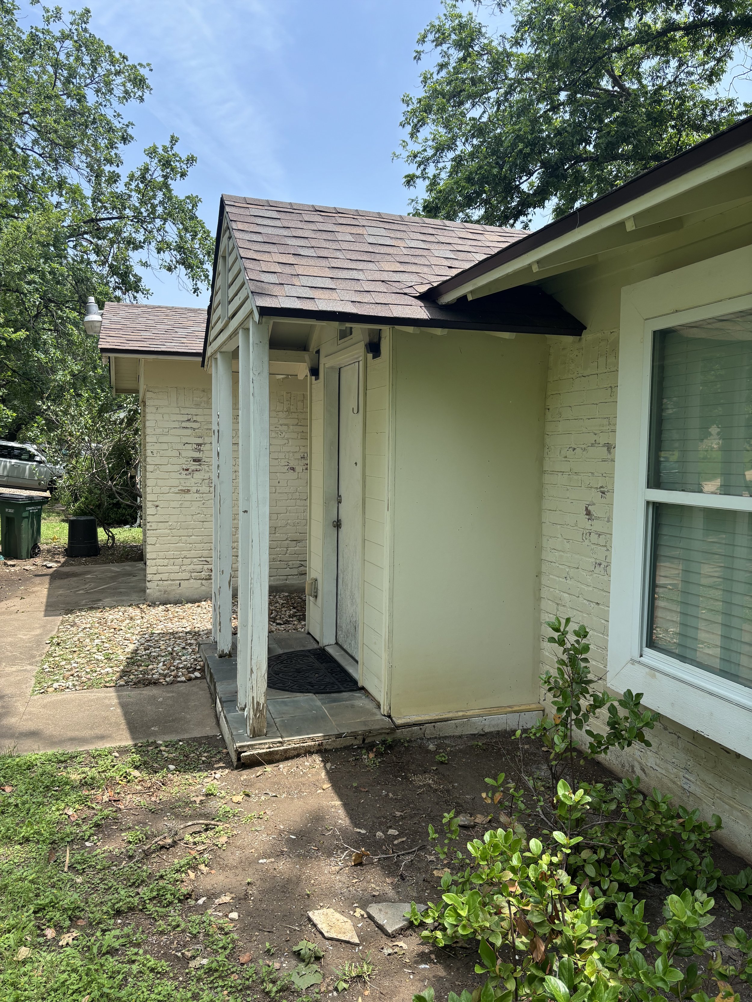
For this Austin project, our client had a brick home with potential but suffered from a dated, uneven cream-yellow exterior base, weathered white porch columns, and a front entry that faded entirely into the shadows. The owner lived out of state for several years and is ready to move back to Austin. Here is the process of how we partnered with them to orchestrate a modern-organic color pivot.
1. The "Before" Assessment & Structural Reality
Every consultation begins by assessing the hard, unchangeable architectural realities. In the initial walkthrough of the property, we noted a few critical challenges: 1) the existing masonry had a blotchy, aging yellow-white finish, 2) the porch structure was showing signs of wear with flaking paint, and 3) the front door was deeply inset under a porch overhang, rendering the entry entirely dark and uninviting.
The objective was clear: clean up the visual noise, unify the multi-textured facade, bring the front entrance forward visually, and frame the property beautifully against the mature green trees enveloping the site.
2. Developing the "Soft Mineral & Pewter" Palette
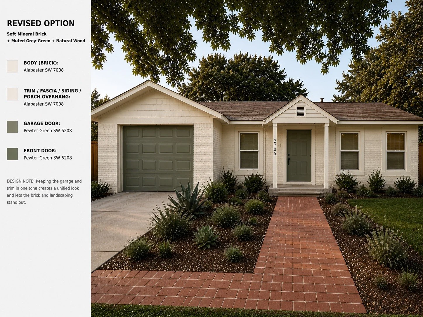
To breathe life back into the property, we curated a custom, minimalist color block layout. Instead of fragmenting a one-story home with contrasting trim and body colors, the interior designer chose a sophisticated monochromatic base using Sherwin-Williams Alabaster (SW 7008). By painting the brick body, fascia, siding, and porch overhang the exact same clean hue, we instantly erased the home's fragmented lines, giving it a grander, more sculptural silhouette.
To anchor this bright mineral foundation, she selected Sherwin-Williams Pewter Green (SW 6208)—a deep, muted gray-green that perfectly bridges the gap between clean contemporary design and the natural woodland surrounding the lot.

Body & Trim:
Alabaster SW 7008

Garage & Front Door:
Pewter Green SW 6208
3. The Designer Mockup & Visualization
For most homeowners, committing to painting brick and choosing a dark green garage door induces immediate anxiety. This is where the digital studio workflow becomes invaluable. She generated color mockups to accurately project how the undertones of Alabaster and Pewter Green would interact.
Designer's Note: Keeping the garage door and trim in a unified tone creates a seamlessly balanced look. It allows the soft mineral brick and the rich texturing of the landscaping to stand out, rather than competing for attention.
Before
Design Mockup
4. Execution & The "Post-Project" Reality
With the digital rendering serving as our north star, our interior design partner handed over the color specification packet for us to paint. The entry porch column trim was fully repaired and painted, pulling the alcove out of the shadows. The garage and front doors received low-lustre coats of Pewter Green, set to match the organic texture of the coming landscaping overhaul.
The final result completely reimagines the home's curb appeal. By utilizing professional color placement rules, a house that once looked dated and weathered now presents as a premium, highly intentional architectural statement.
Ready to elevate your home's first impression?
Let’s eliminate the paint guesswork. Contact us today to schedule your custom painting estimate appointment and fall in love with your home all over again.
